Listing optimization
Improve product images
How to use the Advigator Chrome Extension to compare main and secondary product images
An attractive, high-quality image is essential for making a strong impression on potential buyers, capturing their interest, and inspiring them to make a sale. The main image is the most important part of a product listing to lead to a sale.
How it works
- Install our Chrome Extension
- Go to your ASIN page
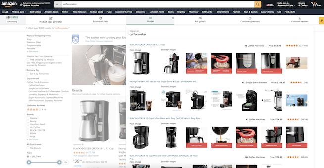
- Click on “Images” tab, like the screenshot below.

Main Image
The primary goal of your main image is simple: attract clicks directly from search results. This image plays a crucial role in influencing your click-through rate (CTR), which reflects the percentage of visitors engaging with your listing.
For maximum impact, follow these Amazon image guidelines:
- 85% product coverage: Use a clean, white background.
- 1500x1500px size: Include a 10px white border.
- No extra elements: Avoid logos, watermarks, or distractions.
- Solo product: Keep the focus solely on the item.
- Good lighting: Ensure the product is bright and clear.
- Minimal shadow: Maintain focus on the product.
How to A/B Test Your Main Image
To A/B test your main image with Advigator, follow these steps:
-
Gather Image Ideas: Use the Advigator Chrome Extension to explore competitors for main image ideas. Send these ideas to your graphic designer to create a few variations. You might find freelancers on Fiverr or Upwork to help with this.
-
Run Campaigns: Start your ads campaign with Advigator and run it for a set period, like one week, ensuring no holidays or events disrupt traffic. Use the same campaign settings throughout the test.
-
Track CTR in Analytics: After each week, go to the Advigator Analytics section and note the CTR for that period. Keep track of these numbers in a spreadsheet.
-
Change Image Weekly: Each Monday, swap the main image in Seller Central and continue running the campaign with no other changes. You don’t need to change anything in Advigator regarding the campaign.
-
Identify the Best Image: After several weeks, compare the CTRs. The main image from the week with the highest CTR is your winner.
This method ensures a data-driven approach to selecting the best-performing image.
Why maxime CTR?
A high click-through rate (CTR) means you’re capturing more search traffic, leading to more clicks. Amazon also rewards products with higher CTR by giving them better rankings in search results. This means you can improve your product’s visibility without increasing your bids. Pretty great, right?
Secondary Images
While the primary image drives clicks, secondary images are what close the sale. These 4-5 images need to focus on converting visitors by showcasing your product’s value. With most purchases made on mobile, design these images with mobile users in mind. A common mistake is to use secondary photographs to simply show the product from different angles.
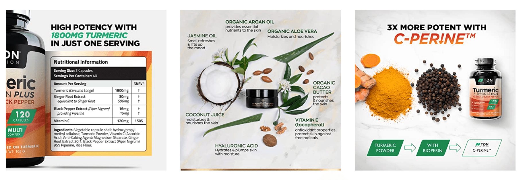
Here are some examples of secondary images taken from the Advigator Chrome Extension > Images tab, found by searching several keywords on Amazon.
Product vs. competitors
Compare your product with a generic competitor in a simple and clear way. You must not use a competitor’s brand name, but you can say “our product” versus “other brands”. Communicate your main features/benefits. They might not even read all of the texts and might see just a couple of words as they scan them.

Features and benefits
Features describe the technical aspects of your product, like quality, durability, or flexibility. Benefits explain the impact on the customer, such as improved health or more free time, and highlight how your product helps them achieve their goals. These are typically showcased across multiple images.

What’s included
If your product requires accessories, clearly show whether they’re included. This helps customers know if they need to buy anything separately or if they can use the product right away. Clarifying what’s not included prevents negative reviews due to unmet expectations.

Size and weight
This image provides detailed information, either in a table or through real-life context, such as showing the product in someone’s hand. Include data in various units and explain how customers can calculate measurements. For products with multiple variations, use this image to guide customers in choosing the right option.

Ingredients and materials
Often this is just a shot of the ingredients label. You could also show actual ingredients like actual turmeric root or pepper.

How it works
Show a clear, step-by-step guide on how to use or install the product. Customers expect a simple, hassle-free experience to get started. Without this information, they may feel discouraged from buying or look elsewhere for answers.

Use cases
Demonstrate your product in real-life scenarios, showing where and how it can be used. This builds customer confidence, helping them see its versatility for various situations and activities.

Awards or certifications
Showcase any industry awards or certifications your product has earned. This boosts brand credibility and fosters customer trust.

Generate ideas with AI
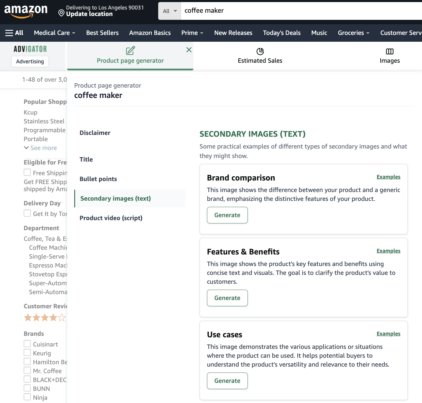
The Advigator Chrome extension also provides ideas for secondary images based on the keyword. This includes examples of different types of secondary images and what they might show.
How it works
- Install the Advigator Chrome Extension
- Search your main keyword on Amazon (e.g. ‘yoga mat’, ‘coffee maker’, etc.)
- Click on the ‘Listing generator’ tab
- Scroll down to the ‘Secondary images (text)’ section

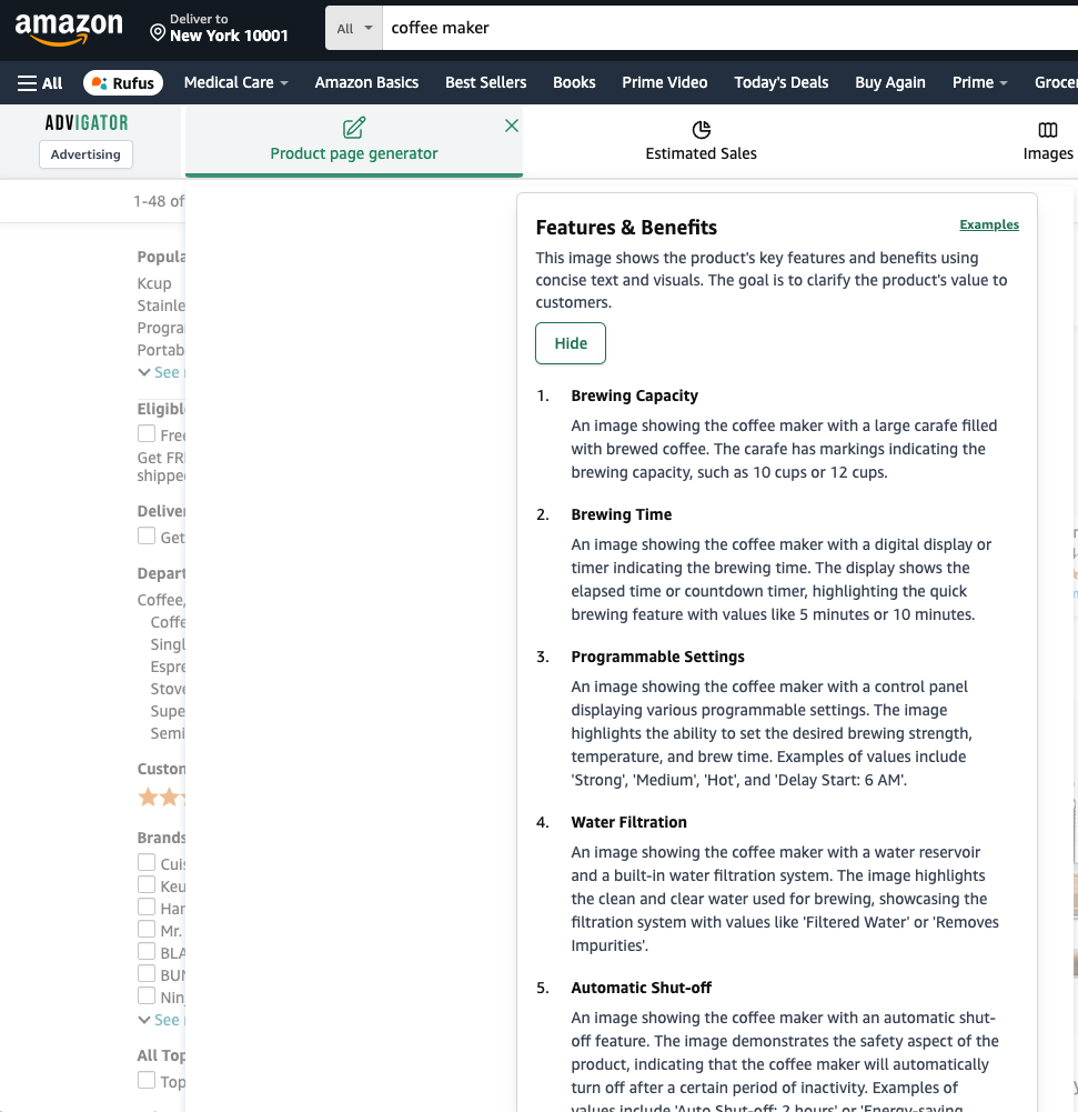
Example: Coffee maker
Below you can see the secondary image suggestions for the keyword coffee maker for a “feature & benefits” image.

